Cuisine in good tempo
Metronome is a modern French restaurant named for its precision and harmony: principles reflected in its award-winning leadership and carefully composed sensory experience.
Branding • Logo design • Visual identity
-
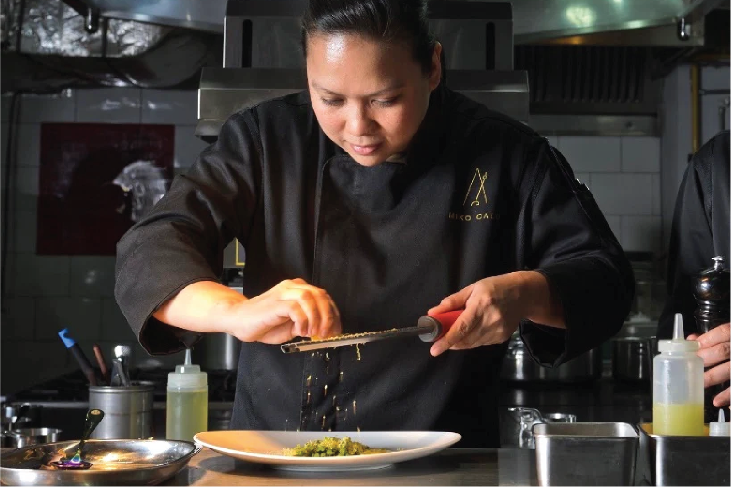
Inspired by childhood memories of a home filled with classical music, Chef Miko Calo chose the name Metronome as a symbol of precision and harmony to reflect her approach to cooking.
Create a brand identity in sync with Metronome’s culinary philosophy.
Capture the rhythm and mastery that define both the cuisine and the interiors.
Reflect Chef Miko’s elite training at École Grégoire-Ferrandi in Paris and her years in Joël Robuchon’s Michelin-starred kitchens.
-
Designed a distinctive icon and wordmark inspired by Art Deco geometry, with a feminine and contemporary edge.
Developed a visual system of rhythmic lines and restrained typography, echoing the structure and grace of musical notation.
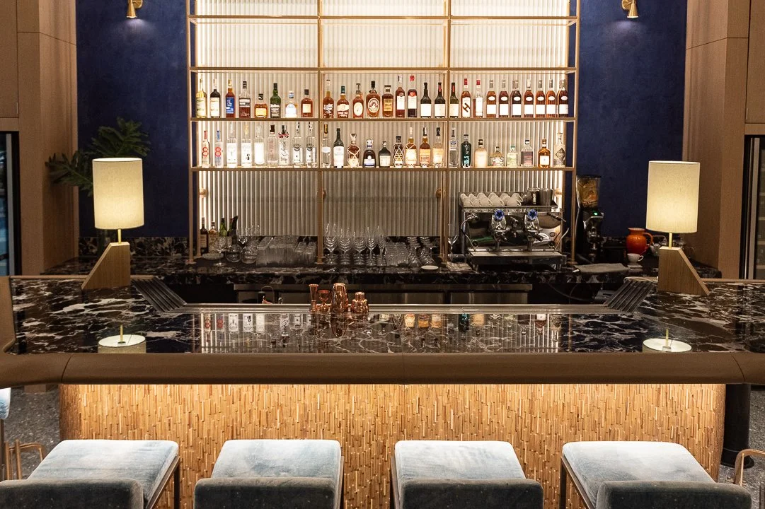
Integrated a refined palette of deep blue and gold, mirroring the restaurant’s interiors.
-
A visual identity that expresses tempo, elegance, and creative control.
Seamless cohesion across signage, menus, uniforms, and digital platforms.
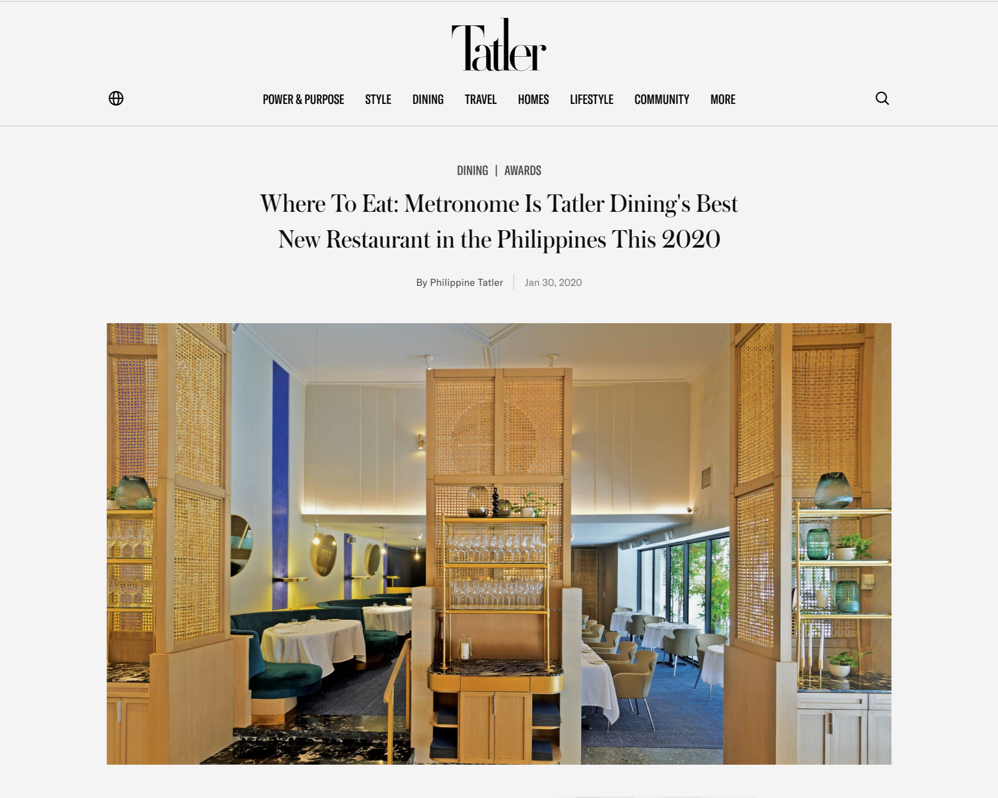
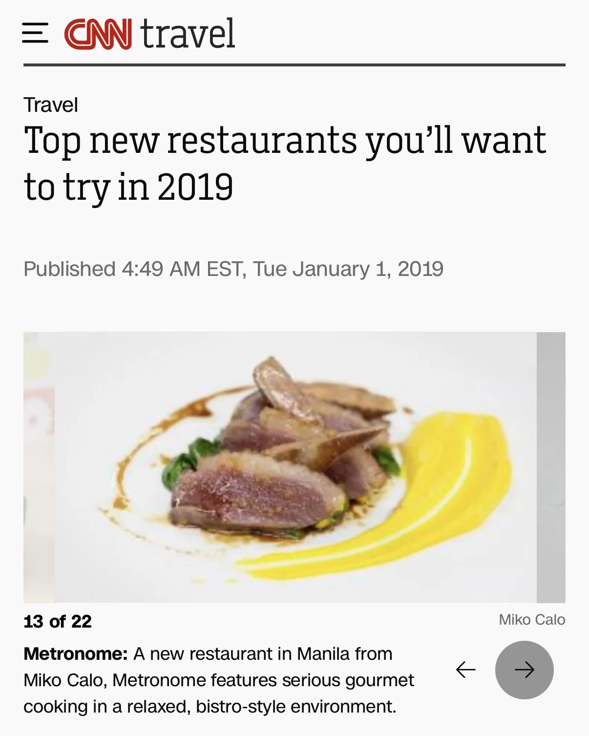
Named one of CNN Travel’s World’s 15 New Restaurants to Try (2019), alongside Art Yard in London and Alain Ducasse’s Ômer in Monaco.


Brand accolades
CNN Travel 15 New Restaurants to Try, 2019, Tatler Dining Best New Restaurant in the Philippines, 2020, Tatler Dining Chef of the Year, 2022